The first page of your website, a visitor views during a session is known as landing page.
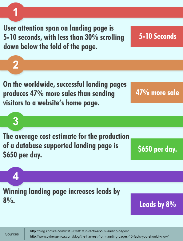
What the session here means?
The session here means the event where you make your user to visit on your website.
One of the event is email marketing. You do email marketing to acknowledge your customer about new products. It can also include offers related to your products.
So it becomes very compulsory that your landing page should motivate visitors to become your customer. By this, I mean to say that it should give a clear and beautiful description of your product. In a way, it should able to guide your’s, going to be customers.
Many of you might knows that there are certain elements that makes the winning landing page such as:
- A strong and meaningful headline
- Concise, Convincing copy
- An eye-catching, clickable button with a clear call to action.
- A user friendly form
- Clean attractive design.
But these elements should focus the purpose and reflect only one goal, the goal to convince your site’s visitors, so that they can able to convince themselves to become your customer.
Now, I give you a brief report how InkThemes have used above key points to make its landing page. One thing to notify is that, whatsoever the element of landing page is, it should include one factor i.e. clarity of conveying messages.
Strong Heading
What can be the more strong heading other than using the name of the product or the benefits related to your product. Headline should start a connection with your page. Keep the headline straightforward. No distractive phrases, no hype words but a focus message.
Clear and Concise Content
Many might have confused with the fact, what makes the product description more readable to the users?
Here is the answer for this…
Content should involve unique selling proposition about your product (USP). By USP I mean to say, content should deliver the message, Buy this product for this specific benefit. It includes different outlook and logic of your product. But, remember it should be as transparent and real as your product.
In fact sliding images on the extreme top of the fold, are playing a very important role in providing a transparent view about the theme.
Tell your visitor What They Will Get
As I mentioned above USP in your content is very vital for a landing page, but to make it more interactive such that it can give*
*Product knowledge
*Brand awareness,
You can include graphics depicting your product insights. For example, InkThemes displays a magnified image of its theme with a small textual description of each element of the theme.
It provides following benefits:
- Segmenting the elements of theme
- Personalizing viewers about the theme.

Besides, their is a Preview button. This will show live theme view. So, there is no chance for a user to skip visiting any part of the theme.
Interactive Call To Action
What can be the best call to action, is a big mystery. But according to Unbounce landing page CTA should have two factors i.e.Value and Relevance.
- Is the CTA is valuable enough to motivate the customer to click on it?
- Is the CTA itself conveying what they will get by clicking?
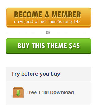
For e.g. at the InkThemes landing page, there are 3 CTA.
It’s one of the CTA is saying Free Trial Download, that means prospects can access the themes for the trial absolutely free.
But instead of this, if it would be “Download Now”, it would not show that much relevant effect in front of users.
Trust icons
Though your website and it’s services are genuine but it’s credibility needs to be reflect in front of your user. Therefore trust icon or badges are necessary on your site’s landing page. Trust icon can be related to your site’s security/privacy policy/services. Some are mention below.
Let your visitors relax and buy products.
Social sharing icons
Make your visitor to share your site’s landing page to a broader audience. So, social sharing buttons are very important in this regard. Better to create more oppurtunity for your business, better the business.
Cute forms
I use the word ’cute’ in front of form because, it’s the most targeted element which makes your visitor to turn into a prospect or let them go off like an anonymous user.
Fields should be very limited in number. In fact, include those fields which do not make your visitor think and rethink “ Is it worthy to fill this information? ” Or “ This is so unnecessary, it’s better to leave the site”.
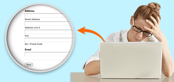
Forms play a major role in changing the behavior of a visitor. They can either In the visitor to become lead or completely let them go out of sight. Visitor should not feel bore by seeing your form. They should feel energetic and should able to say ”I will fill this form!”
Let me give you a creative way to include forms on your landing page.
- Use Tabbed forms, it will occupy a very little space on your landing page, when the user clicks on it, form will appear in the pop up window.
- Another way is that what InkThemes have used. You can see, their are two CTA’s on the top-right corner of the page. If a user is completely satisfied with a theme, it will click on the CTA to take further action.
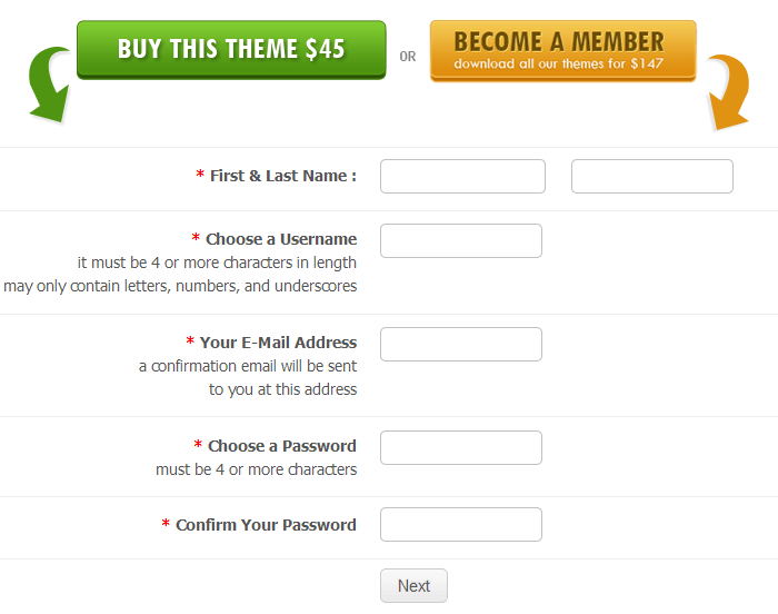
It’s easy in navigation and friendly to fill.
Whitespace
The term simply means the space which is not being used by any content, i.e. text, images etc.
Whitespaces plays a single but important role on your website’s landing page i.e. to give an eye-loving and clutter-free view to your users.
Landing page should not be congested with lumpsome things collected on a single place.
Let your user feel the smooth breeze while browsing the page.
Mobile optimized landing page
43% emails are opened on mobile devices.
In fact, 40% of users turn to the competitor’s website’s after a bad user experience on a particular site. So, it’s very important your visitor can able to get a clear landing page view on iPhone, iPad, Android phone, tablets.
Try to include actionable targets without zooming.
The figure is wide, 17.4% of global traffic comes through mobile. So, your landing page should be mobile friendly.
Well these were the basic attributes of landing page. But this is also a true fact that successful landing page is not built in a day. It has to go under periodic testing, so that you can analyze the ins and out of the page.
Speed is Crucial
According to Hubspot, a one second delay in page load time results in “11% fewer page views, 16% decrease in customer satisfaction and 7% loss in conversion”. It’s quite terrific. According to Google Analytics the median loading time time of desktop websites are 2.45 seconds. That means, half of the websites loads faster than 2.45, and half loads slower.
Average page load time is upto 7 seconds. Whatever, it is some visitors are so impatient that if they do not got your site visible to you in 1 second they will run out of your site. It’s rare case, but still if you could perform your site speed as faster like it can load in 3 seconds, it will be good for your site performance.
Therefore make your site fast, make it better.
A/B testing
A/B testing is milestone of landing page success. It is an only scientific approach of finding weak and strong points of your website’s landing page.
A/B Testing figures out what works in the present web era.
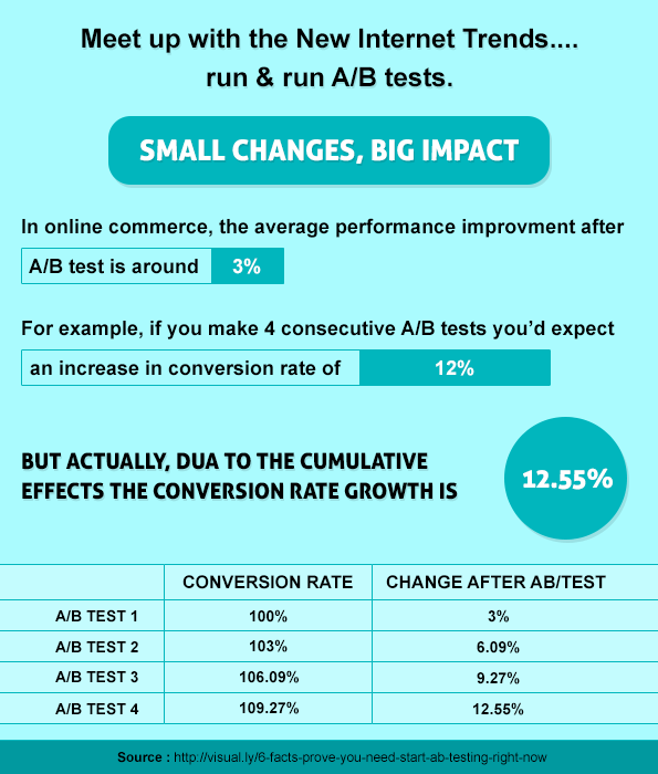
You can analyze the behavior of your visitors that how they react towards each element, while browsing your landing page.
Through A/B testing, find the efficiency of :
- CTA’s color, size, shape and call appeal
- Landing page heading
- Number of fields in the form
- Form’s heading
- Position of CTA, form
- Colors of each and every element of your landing page
A/B testing tool
What above I have described, is the scope of improvements in landing page for email marketing.
But there is one more event where visitors land on your website,
i.e. from organic search results.
Home page or Landing page. Is it right?
Yes.
When visitors fall on your website directly or indirectly through your search results, your site’s home page will act as a landing page.
It should be very specific to hold visitors on your site. From the very first moment when an anonymous user land on your site, they should able to extract the objective of your site.
Again I will take an InkThemes home page and extract out its valuable point.
- A clear heading and product video that defines the website objective. So, any anonymous user once land on the page will know what website is meant for in seconds.
- A well defined CTA. As you can see, the CTA delivers the relevancy and shows what the user will get when they click on it. Its completely partial.
- Owner’s image. To give a more worthy and trustful value to your site, owners image plays a big role. It not only increases the connection coefficient, but also gives a relief in your visitor’s mind that they are going to connect to some genuine business.
- Product Thumbnails. Again the concept comes “show your visitors what you are giving”, that means, without any further delay, your visitors can view the real insights about your product from the home page itself.
You can see that, with the help of these elements located on above the fold, user can scan your whole website.
At least, they can order their mind to stay on your site and do a more search. That’s more important, rest depends on your further strategies.
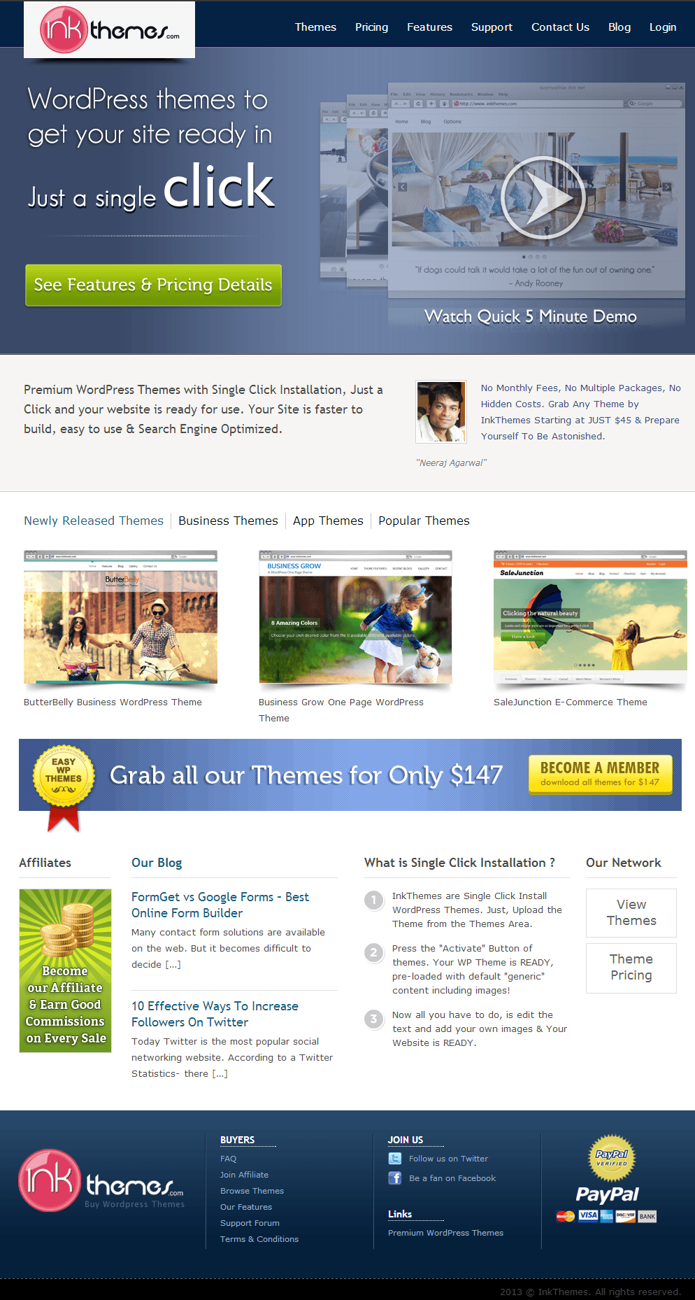
Apart from it, user can see it’s trust badge, recent blogs, social sharing icons. Each and every element on landing page is equally important.
Every element should able to give these impression’s in user’s mind:
- Genuinity
- Interactivity
- Quality.
A/B Testing Tools
Tools For Creating Landing Pages
Conclusion
Landing page optimization is a long-term approach. One should not stop experimenting with different things on landing page in a standard manner.
Grab the term Reptilian Brain. A brain that able to stick on your landing page like a reptile on wizard. Let your user to incharge this brain!
Related Item:-


