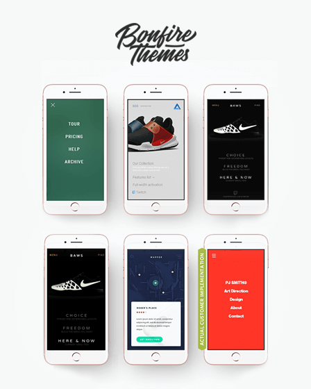
This mobile menu WordPress plugin helps you to build a mobile-friendly off-canvas menu for your website.
It means whenever users open your website, only the menu button will appear on their screen. Hence, they can click on the button to view a complete menu & easily navigate through your full website.
Moreover, the plugin comes with excellent features such as menu fly-outs, background image & color options, multiple widgets, etc.
Key Features Of WordPress Mobile Menu Plugin –
[su_icon icon=”icon: reorder” background=”#ffffff” color=”#000000″ text_color=”#161a1a” size=”28″ shape_size=”4″ radius=”0″ text_size=”23″]Attractive Menu Button Styles[/su_icon]
This TapTap mobile menu WordPress plugin comes with 6 different menu button styles that you can use to create attractive buttons on your website.
Moreover, you can make various types of customizations for buttons such as –
- Easily place menu button either left or right. Also, manage its top & side distance with per-pixel accuracy.
- All buttons have 2 different inbuilt animations. Further, define the time by which the effect appear & disappear.
- Customize the button color, hover color, opacity, etc.
- Add a custom label text & place it anywhere nearby the button. Additionally, if a menu button is hidden, the label will remain visible.
- Also, edit the font size, letter spacing, color, hover color, etc for label.
[su_icon icon=”icon: list” background=”#ffffff” color=”#000000″ text_color=”#161a1a” size=”28″ shape_size=”4″ radius=”0″ text_size=”23″]Add Logo With Menu[/su_icon]
You can add an eye-catchy logo along with the menu that will appear on a user’s screen whenever he clicks on menu button. Besides, you can add a logo in 2 different ways such as a text & image.
Hence, with the image logo, you need to set the image size & align it to left, center or right.
On the other side with a text logo, you can specify the text font size, letter spacing, color & hover color.
[su_icon icon=”icon: gear” background=”#ffffff” color=”#000000″ text_color=”#161a1a” size=”28″ shape_size=”4″ radius=”0″ text_size=”23″]Fully Customizable Menus[/su_icon]
With this plugin, you can easily create menus for your website & manage following different types of settings –
- Set attractive animations for menus by adding the effects such as fading in or sliding from left, right, top or bottom, etc customizing the speed for the same.
- Specify alignment for the content of a menu either left, center, right, or top, middle, bottom.
- Allow users to close the menu on desktop devices via the ‘ESC’ button.
- Set an option to close a menu clicking on any menu item.
- Manage left, right & bottom padding settings for menu container. Also, you can set a suitable width for the content included in a menu container.
- Add an attractive background image for the menu. Besides that, you can also create animated, patterned, colored & pulsating backgrounds.
Menu Fly-Outs – The menu fly-outs are basically sub-menus of the main menu that will open when a user clicks on navigation buttons. Hence, you can create multiple menu fly-outs either as full-screen or set custom width & height for it.
Menu Headings & Subheadings – The plugin allows you to manage the visibility of the headings & subheadings of a menu that will appear whenever users click on the menu button.
Thus, you can customize the font size, background color, letter spacing, line heights, top and bottom margins, etc for them.
Moreover, you can add an image with header & also add a link with it. So, whenever users click on the image they will be redirected to any other page.
[su_icon icon=”icon: search” background=”#ffffff” color=”#000000″ text_color=”#161a1a” size=”28″ shape_size=”4″ radius=”0″ text_size=”23″]Use Of Search Button[/su_icon]
With this mobile menu WordPress plugin, you can add a search button on your website & allow visitors to easily explore your website. Further, you can make any type of changes in a button’s visibility such as –
- Set button position either left or right with proper per-pixel accuracy.
- Optionally, add variations in search buttons.
- Also, you can apply attractive animations with the search button.
- Add a custom label text with button & set label position, font size, letter spacing, color & hover color.
- Display a custom placeholder text in a search field, that will appear until the user starts typing in it.
- Edit the search field height, font, letter spacing, background opacity & colors.
[su_icon icon=”icon: unsorted” background=”#ffffff” color=”#000000″ text_color=”#161a1a” size=”28″ shape_size=”4″ radius=”0″ text_size=”23″]Customizable Scrollbar[/su_icon]
With this mobile menu WordPress plugin, you can activate the scrolling feature for menus. Consequently, users can easily scroll your menu items via a scrollbar.
Also, customize the multiple scrollbar elements such as colors, thickness, distance from the sides, corner roundness & so on.
More About WordPress Mobile Menu Plugin –
- Easily edit the menu background overlay color & opacity.
- The plugin allows you to add links in menu heading texts.
- This plugin provides you with 3 different content animation effects such as scaling, opacity & blur.
- You can display eye-catchy widgets either above or below the menu. Also, set a custom font, letter spacing, line heights, colors for widgets.
- Show menu either on both mobile & desktop devices or only on mobile.
Additional Features –
- RTL Compatibility
- Fully Retina Ready
- Provides 600+ Icons
- Multiple Theme Fonts
- 24/7 Customer Support
- Attractive CSS Animations
- Compatible With Multiple Sites


